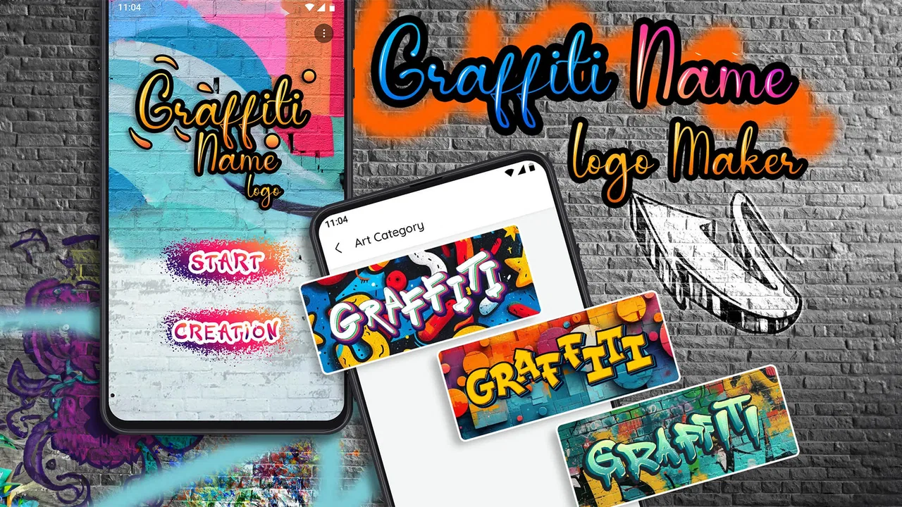
Graffiti Name Logo Maker
- 4.8
- Rating
- 1.00M
- Installs
- Free
- Price
 Analysis by App-foxy
I approached Graffiti Name Logo Maker as a quick creative tool rather than a full photography editor, and that distinction matters. Its purpose is straightforward: turn a name or short piece of text into a graffiti-inspired visual that can work as a profile image, a casual logo, a social post, or a small personal project. After using it, my main impression is that it succeeds when speed and style matter more than deep control. I can get from a blank screen to something shareable without learning a complicated design system.
That simplicity is also the app’s central limitation. I would recommend it to someone who wants an energetic graffiti look without building every letter from scratch. I would not choose it for a business identity that needs a carefully controlled typeface, exact brand colors, or a complete professional identity system. In my experience, it sits comfortably between a playful text generator and a lightweight logo maker, with photography users benefiting from the ability to create a distinctive graphic without opening a desktop design suite.
What the app does well in everyday creative work
The first strength is the short path from idea to result. Instead of beginning with a complex canvas, layers, or a long list of technical decisions, I can focus on the name itself and then explore a graffiti treatment. That makes the app useful when I need a visual quickly: a nickname for a gaming profile, a group name for a chat image, a title card for a short video, or a simple mark for a personal social account.
You May Also Like

 Blood Strike: 2.5 Anniversary
Blood Strike’s Loadouts Turn Every Drop Into a Tactical Gamble
A close look at Blood Strike’s custom loadouts: how fast access to signature weapons reshapes its battle royale rhythm, rewards preparation, and narrows the gap between fights.

 Pandora - Music & Podcasts
Pandora’s Music Is Easy to Start, but Harder to Recover
Pandora’s strength is its low-effort path from a seed to a station. Its weak spot is how much confidence it asks you to place in connection, setup, and quiet recovery.

 8 Ball Pool
 Is Built on Rivalries, Rematches, and Routine
A close look at the rivalries, rematches, shared routines, and unanswered safety questions that turn a quick pool match into a persistent mobile community.

 Samsung Music
’s Quiet Strength Is Playing What You Already Own
Its reach comes less from spectacle than from dependable access to a personal library. That simplicity is both the app’s strongest retention engine and its ceiling.

 AccuWeather: Weather Radar
AccuWeather Review: A Quick, Clear Forecast for Everyday Decisions
For everyday plans, the best forecast is the one you can understand quickly. AccuWeather makes rain timing, radar, and local conditions easy to act on, with a few trade-offs.

 Hill Climb Racing
Why Hill Climb Racing Still Turns Crashes Into One More Run
A tiny car, a bumpy hill and one more upgrade: Hill Climb Racing keeps resurfacing because its simple chaos makes every near-miss feel personal.
More From Our News Desk



The graffiti direction gives the output more personality than ordinary text placed over a plain background. Letters are the main event, so even a short name can feel expressive. I found this especially useful for names that would otherwise look unremarkable in a standard font. The style is naturally bold and informal, which makes it a better fit for youth-oriented projects, music-related posts, street-art themes, and casual online identities than for conservative business materials.
There is a practical advantage to keeping the concept narrow. Many general-purpose design apps offer hundreds of tools, but that choice can slow down a small task. Here, the creative question is more focused: which graffiti treatment best matches the name I want to show? For a user who does not want to spend time learning layout terminology, that focus is welcoming. The app feels designed for experimentation rather than formal production.
I also like the way this kind of tool encourages several quick attempts. A first version may look too busy, too bright, or too aggressive, but making another version is less intimidating than rebuilding a design manually. My useful habit is to create a few variations before choosing one. I compare the shape of the letters at a small size, because a design that looks impressive up close can become difficult to read when used as an avatar or thumbnail.
Why the result can work beyond a simple name image
The obvious use is a name graphic, but the more interesting use is as a supporting element in a larger visual. I can place the generated design beside a photograph, use it as a title over a street scene, or crop it into a small badge for a personal project. This is where the app connects naturally with its Photography category: the result does not need to be the entire composition. It can act as a visual accent that gives an otherwise ordinary image a recognizable signature.
A useful workflow is to decide the final destination before styling the name. For a profile image, I favor a short word with strong letter shapes and avoid overly intricate treatments. For a story or poster, I can tolerate more visual detail because the name will appear larger. For a watermark, restraint is more important than drama; a very dense graffiti treatment may compete with the photograph instead of protecting its identity.
Another non-obvious benefit is that the app can help people test a visual direction before committing to a more advanced design program. If I am unsure whether a graffiti-inspired identity suits a project, I can make a rough concept here first. That saves time and clarifies the brief: perhaps the project needs a cleaner urban style, or perhaps the graffiti approach is exactly the right mood. It is not a replacement for a professional identity process, but it can be a useful sketching stage.
Small decisions that make the output more usable
I get better results when I treat readability as a design requirement, not an afterthought. Long names are naturally harder to handle because graffiti styling can make letter boundaries less obvious. If the name is lengthy, I would test a shortened version, initials, or a nickname. That is not a limitation unique to this app; it is a trade-off built into the visual style, where movement and decoration can compete with clear reading.
Contrast also deserves attention. A vivid name can disappear against a similarly vivid background, especially when the design is later placed over a busy photograph. I prefer to check the result against the kind of image I will actually use rather than judging it only on the creation screen. A graphic that looks balanced on a clean display may need a simpler background or more breathing room in the final post.
For social use, I would export or save the version only after checking it as a small square. This catches a common problem: details that seem attractive at full size become visual noise when reduced. The strongest version is often not the most elaborate one. A clear silhouette and a recognizable first letter can matter more than extra decoration.
Where it falls short and when another app is better
The main weakness is control. The app is good at presenting a ready-made graffiti direction, but users who want precise typography, custom spacing, detailed layer management, or a carefully measured logo system may quickly feel constrained. I cannot treat it like a full vector editor or a complete photo-compositing workspace. Its value comes from convenience, not from giving me every possible adjustment.
That trade-off becomes important when a logo has to work across many formats. A personal profile image can be forgiving, while a business mark may need to remain consistent on a website, printed material, packaging, and large signage. In that situation, I would start with a dedicated branding or vector application instead. Graffiti Name Logo Maker can help explore an idea, but I would not rely on it alone for a formal identity that requires exact reproduction.
There is also a stylistic limitation. Graffiti is a strong visual choice, not a neutral one. If I need a calm, elegant, minimalist, or highly traditional appearance, the app is probably the wrong starting point. Even when the name is readable, the overall mood may still feel too playful or urban for the intended audience. Choosing the app because it is convenient and then trying to force it into an unrelated style would be working against its purpose.
The free entry point is helpful, but the presence of in-app purchases ranging from less than a dollar to nearly a hundred dollars per item means I would pay attention before confirming anything. The app itself is free to install, yet the broader experience may include optional paid elements. I would explore the freely available workflow first and decide whether the additional options genuinely improve my project. For a one-off nickname graphic, spending heavily would make little sense; for someone using the tool repeatedly, the decision depends on how much value those extras provide in practice.
Another consideration is platform compatibility. The app supports Android devices running version 5.0 or later, which gives it a broad technical reach among older phones. Still, I would check the experience on the specific device I plan to use, especially if I am creating graphics for a tablet or an older handset. A simple workflow is most useful when the interface remains comfortable and the finished image can be handled easily afterward.
A realistic scenario: making a group image before an event
Imagine that I am helping friends organize a small music night and we need a quick group image for a messaging channel. We have a name, a rough urban theme, and no need for a complete professional logo. I can enter the name, try several graffiti treatments, and select one with letters that remain clear inside a square crop. I would then place it over a dark photograph or use it as a standalone image, depending on where the group plans to share it.
In that situation, the app is a good fit because the goal is speed, personality, and a recognizable name. Nobody needs a brand manual or a scalable corporate mark. The result only has to look intentional and match the mood of the event. If the same group later needed a printed poster, a sponsor package, and a consistent identity across multiple sizes, I would move the concept into a more controlled design tool rather than stretching this app beyond its strengths.
Who should use it and who should skip it
I think the best audience is made up of casual creators, students, social media users, gamers, small hobby groups, and anyone who wants a personalized text graphic without a long learning curve. It is also useful for photographers who need a quick signature-style visual to accompany an image. The app’s focus makes sense for people who care more about getting a lively result quickly than about adjusting every technical detail.
It may also suit a beginner who is exploring typography for the first time. Seeing how a name changes when treated as a visual object can teach useful instincts about length, contrast, spacing, and hierarchy. I would still encourage beginners to compare the design at full size and thumbnail size, because that simple check reveals whether the graphic is genuinely readable.
I would advise professional designers, businesses with strict identity requirements, and users seeking advanced photo editing to look elsewhere first. Someone who wants retouching, color grading, compositing, or detailed illustration will find a photography editor more appropriate. Someone who wants a polished brand system will need a tool built around precise layout and reusable assets. The app is not failing when it cannot do those things; it is simply aimed at a narrower job.
Its broad audience signals are encouraging. The app comes from GeniusTools Labs, has a 4.7 average from around 29 thousand ratings, and has passed one million installs. Those figures suggest that the simple graffiti-name concept resonates with many Android users. They do not change my practical advice, though: popularity is not a substitute for matching the tool to the job. I would choose it for quick expressive lettering, not because it is expected to replace every other creative app.
What to expect from the current release
The current version is 7.0.2, and the app is marked for Everyone, which fits its accessible concept. It was released on March 24, 2021, so it has had time to establish its place as a focused name-design utility rather than a brand-new experiment. I appreciate that the product identity is easy to understand: it is not pretending to be a complete studio, and that clarity helps set reasonable expectations.
My advice is to begin with a small, specific project. Create one name for a profile, one title for a photograph, or one badge for a group. That makes it easier to judge the style, the reading quality, and whether the available creative choices are enough for you. If you immediately need a multi-page design, detailed image editing, or a carefully documented brand system, you will know early that a different application belongs in your workflow.
For users considering cost, the basic app is free, while optional purchases are listed from $0.99 to $99.99 per item. I would keep the first session focused on discovering what can be achieved without paying. Only after identifying a real obstacle would I consider an optional purchase. That approach is especially sensible for occasional users, because a single social graphic rarely justifies treating the app like a major design subscription.
Overall, I see this as a convenient specialist rather than an all-purpose editor. It gives names an energetic visual identity, supports quick experimentation, and can add a distinctive touch to photographs and social graphics. Its weakness is the same thing that makes it approachable: the experience is centered on a particular look and a relatively simple workflow, so users wanting precision or broader editing freedom may outgrow it.
My final recommendation is clear: try it if you want a fast graffiti-style name graphic for personal or casual creative use. Start with short text, test the design at the size where it will actually appear, and compare a few variations before settling on one. Skip it for formal branding, advanced photo work, or any project where exact control matters more than immediate visual impact. For the right audience, Graffiti Name Logo Maker is an enjoyable shortcut that turns a plain name into something with attitude.
FAQs for Graffiti Name Logo Maker
01What features does Graffiti Name Logo Maker offer?
Graffiti Name Logo Maker comes packed with features that allow you to create stunning graffiti-style logos with ease. It includes a variety of fonts, color options, and background templates. The app also offers advanced editing tools such as layer management and opacity adjustments, ensuring a professional look for your designs.
02Is Graffiti Name Logo Maker user-friendly for beginners?
Yes, Graffiti Name Logo Maker is designed with beginners in mind. The intuitive user interface guides you through each step of creating your logo. With easy drag-and-drop functionality and helpful tutorials, even those with no prior design experience can craft impressive logos effortlessly.
03Can I use my creations from Graffiti Name Logo Maker commercially?
The terms of use for Graffiti Name Logo Maker allow for personal and commercial use of your designs. However, it's always recommended to review the app’s licensing agreement to ensure your specific usage complies with their terms, especially if you plan on selling or distributing your designs.
04Does Graffiti Name Logo Maker require an internet connection to function?
No, Graffiti Name Logo Maker can work offline once downloaded, which means you can create and edit your designs without an internet connection. However, certain features like downloading new templates or sharing directly to social media may require you to be online.
05Are there any in-app purchases in Graffiti Name Logo Maker?
While Graffiti Name Logo Maker offers a free version with basic features, it also includes in-app purchases. These purchases can unlock additional fonts, templates, and advanced editing tools. Users can choose to buy individual items or opt for a subscription model for full access.
Pros
- Easy-to-use interface for beginners.
- Wide variety of fonts and styles.
- Customizable color palettes.
- Quick export options to share designs.
- No watermark on saved images.
Cons
- Limited free features; in-app purchases.
- Occasional lag on older devices.
- Ads can be intrusive at times.
- Limited background customization.
- Requires internet for full functionality.

Graffiti Name Logo Maker
Gallery